Woman designing a website for accessibility

When designing or redesigning your business’ website, you should be trying to make it accessible. Having an accessible website is of practical interest to your business since it allows users with a range of hearing, movement, visual, and cognitive abilities to access your website and become potential customers or clients. It’s also a legal requirement to have an accessible website since January 2021 according to the Accessibility for Ontarians with Disabilities Act (AODA) if your business has over 50 employees. Since website accessibility is so critical, we’ll highlight some of the best practices and tools to help you ensure your business’ website has maximum inclusivity.

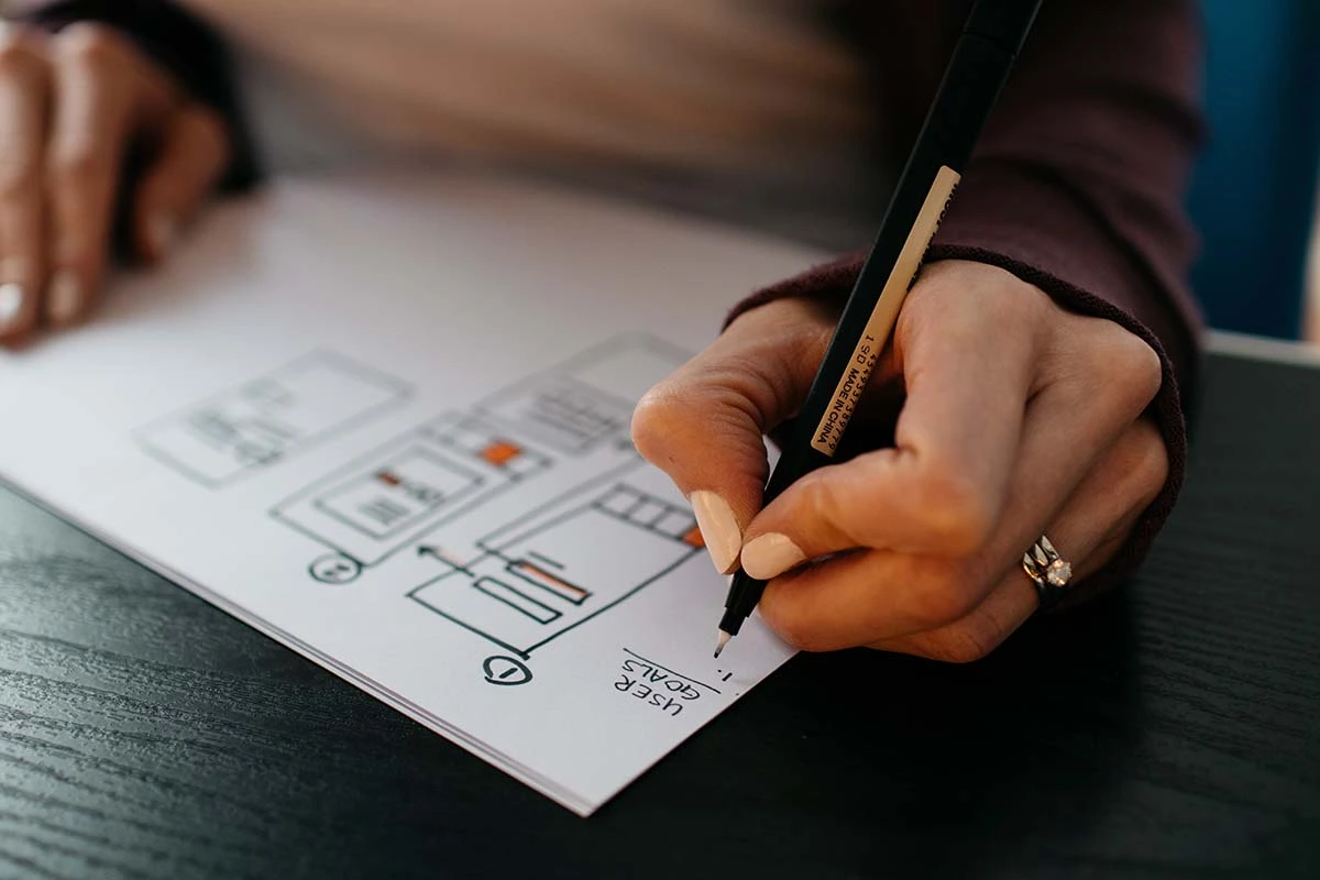
How to Know if Your Website Design is Accessible

There are numerous potential concerns for building an accessible website, so how do you ensure your design is inclusive? For that, the World Wide Web Consortium has created a set of international guidelines: the Web Content Accessibility Guidelines (WCAG). These are continuously revised and are currently in version 2.1, with 2.2 to be finished in the coming couple of months. These provide both quick introductions and thorough overviews for inclusive website design and will help you start designing for accessibility and identify any potential concerns.

Best Practices for Building an Inclusive Website

There are many things to consider when building an accessible website design. Here are some of the best practices to build and design an inclusive website:

  1. Start with accessibility in mind. It will be much easier to design a website that meets accessibility standards from the start of a design rather than trying to accommodate these afterwards. 
  2. Make sure content is accessible to users in the ways they can perceive. People have varying levels of ability to perceive by sight and sound, so an inclusive website provides alternatives for accessing content.
    • Use a variety of media, including text, video, audio, and images to convey information. 
    • Audio should be captioned or transcribed for speech or include a description for non-verbal sounds such as music.Include descriptive audio which explains what is happening in a video.
    • Write detailed and descriptive alternative text (alt text) which describes the contents of an image or video in detail.
  3. Be sure to consider text and screen readers when writing any copy or content. Some might not be able to read the text on your website due to their visual or cognitive abilities.
    • For example, don’t include excessive emojis. Screen readers read each of these individually. So a string of 👏👏👏 will be read as “clapping hands emoji clapping hands emoji clapping hands emoji.”
  4. Write with simple language to make it more accessible and inclusive. Often, it’s recommended to write at a “10th-grade reading level.” If more complicated terminology is needed, create a glossary that explains these terms in more simple language.
  5. Make sure your website scales. A scalable website modifies its appearance depending on the screen and text size of the user. This accommodates both the user’s device and personal settings for an accessible experience.
  6. Use spacing, headings, columns, and lists on your pages and blogs. These visually organize your materials into appropriate topics, that allow users to quickly recognize subjects and a page’s organization. Screen readers also use headings to navigate a page, so they are essential for anyone using such tools.
  7. Use sufficient contrast between the background and foreground. Inclusive websites make content easily discernible, and contrast is a huge part of that. For example, black text contrasts more heavily on a white background than a gray font.
  8. Along with contrast, be mindful of colour choice. Visual colour deficiency (often called “color blindness”) is common. While less typical in females, 8% of males in Canada have some form of colour deficiency
    • Use high contrast colours or one colour with grayscale. If using multiple colours, ensure they are visually distinguishable for someone who sees those colours less prominently or not at all.
    • Never use colour as the sole way to convey information in a design. For example, in a bar graph, include numbers, text labels, or texture. Someone with red-green colour blindness will have a lot of difficulty differentiating between a red and green bar.

Tools for Designing an Inclusive Website

Since website accessibility is a major concern, there are many tools that help you evaluate its compliance. The World Wide Web Consortium has a list of evaluation tools that includes over 160! These various tools are designed to identify concerns and either suggest changes to improve accessibility or automatically provide them. Here are just a few of Rosewood’s favorites:

AccessiBE

We regularly use AcessiBe when building websites. This AI-powered software continuously scans a website for accessibility concerns and updates pages to be WCAG 2.1 compliant.

They also provide accessScan which will immediately determine if a website is compliant with accessibility standards.

WAVE

WAVE is developed by WebAIM at the University of Utah. They provide comprehensive tools for evaluating and reporting your website’s compliance with WCAG standards. WAVE itself tests one page at a time, but provides a more enterprise-level service through Pope Tech that’s priced according to the number of pages it needs to scan. 

tota11y

tota11y is a free accessibility tool that helps you visualize and understand how assistive technologies interact with your website. The tool was recently deprecated in May 2023 by Khan Academy, so its development has ceased. It won’t stay up to date with the latest accessibility standards and may eventually become dysfunctional on newer websites, but for now it’s still an easy and powerful tool to quickly determine your website’s inclusivity.

Start With Accessibility in Mind

With these tips and tools, you can create a website that both complies with legal standards and is accessible to as many potential customers or clients as possible. That will ensure your business’s website has its greatest reach. Our designers are experts in accessible designs and compliance, so if you want help ensuring your site’s accessibility or want an inclusive redesign, contact our web design team.

Computer mouse over a spam inbox with 372 emails

Email is still one of the most powerful marketing tools and platforms for communicating with your audience and customers. With over 4 billion users, most people prefer to receive brand communications via email. However, your email marketing and communications can only work well if your email retains a healthy reputation and avoids spam complaints. Otherwise, you’ll impair your ability to communicate with your customers, market effectively, and could even suffer fines. This can all be a little complex, so to help you understand all this, we’ve created a comprehensive guide to email reputation and spam complaints.

What is Email or Sender Reputation?

Email is extremely easy to send and automate. As a result, it’s also easy for someone to send countless unsolicited emails. If there were no filtering and monitoring systems, everyone’s inbox would quickly become inundated, at least more than they already are, with emails. As a result, internet service providers (ISPs) and email service providers (ESPs), like Gmail, use reputation systems to separate legitimate emails from fake or malicious ones. They track the his reputation by the number of emails sent in a certain time, their open rates, the engagement levels, and parsing the email text for malicious or deceitful content. If too many are sent, unopened, or users report your emails as spam, your email domain’s reputation reduces. If it drops too low, your emails become undeliverable. Conversely, if emails are opened and clicked, the reputation increases and emails will reach their targeted inboxes.

Why is a Low Sender Reputation Bad?

If an email domain has a bad reputation, their emails will be filtered to the junk/spam folder or worse, never reach a mailbox. In either case, your email marketing and communications won’t reach the recipients’ main inboxes and will remain unopened. Developing a bad email reputation becomes a circular problem. As less emails reach recipients’ inboxes and reroute to spam folders, your audience opens and enages with less emails. If low enough, further negatively impacts your reputation. A bad reputation won’t affect just newsletters or other broad communications. With a low enough reputation, even purchase or order updates won’t be delivered. That’s why maintaining a healthy email reputation is vital to your business’ online operation as well as its marketing. 

Developing a Healthy Email Reputation

When you start sending email communications, your email will have little to no reputation, good or bad. As a result, you will need to slowly build up and strengthen it. To do this you will need to start sending emails that are opened and clicked. Shipping and purchase confirmations will help with this. If you are sending communications to a set of subscribers, like a newsletter, you will start sending in smaller batches to avoid looking like an automated spammer. Most email services, like Klaviyo, provide this as a warming up process. You will also need to repeat the same warming process should you change your ESP.

Some other strategies to increase sender reputation are to only include links to reputable websites. Personalizing emails will increase your open rate, indirectly improving your reputation. You will also want to avoid any spam complaints, so be sure to send emails to recipients who have consented and are expecting to receive emails from your business. 

Avoiding Spam Complaints

One of the main things that can harm your email sender reputation out of your direct control are spam complaints. Most ESPs allow for users to identify and report an email they’ve received as spam. When they do this, the complaint is registered to the ESP, and ISPs track this event. As a result, your reputation will quickly reduce as multiple users report your emails as spam. To avoid those, you will want to send emails that are expected and wanted by your audience. It’s also good to avoid spammy phrases, like “free”, “bargain”, “cash”, or all capitals. Users are more likely to immediately report these emails as spam, and ESPs can automatically filter these phrases to spam. 

Canadian Anti-Spam Legislation

Avoiding spam complaints isn’t just a matter of interest and email efficacy. It’s also the law in Canada since 2014. Canada has anti-spam legislation (CASL) which makes it illegal to send unsolicited emails or messages to those who haven’t provided their consent. Lack of consent is a primary issue and is the cause of over half (68%) of reports made to CASL. Consent is either explicit (someone has agreed verbally or in writing to receive emails) or implicit (a previous interaction with your business allows you to send pertinent emails for a limited time.

To send newsletters or other broad marketing communications under CASL, you need explicit or implicit consent. However, implicit consent is time-limited at a maximum of 24 months, still requires thorough records proving it, and most third-party platforms have more strict terms of service that will require explicit consent regardless. That’s why it’s best practice to and we recommend you obtain explicit consent. Plus, consent must be easily revokable at any time through an unsubscribe link at the bottom of your email. Many email marketing platforms such as Klaviyo and Mailchimp will require you to have one in your email before it can be sent and will include one for you.

If you lack that consent and send emails, your business is in breach of CASL and recipients can report you to the government. Nearly 6800 reports are submitted weekly. Enough reports can lead to an investigation and possible fines. Fines begin at a few thousand dollars, but an individual can be charged per violation up to a maximum of $1 million, while a business can be required to pay up to $10 million for spamming recipients. Along with the fines, your business’ violations and penalties will be recorded on the government of Canada’s website. That will harm more than just your email’s reputation. Plus, ISPs and ESPs monitor these lists, and your business will be recorded, requiring you to rebuild your sender reputation.

The Responsibility of Email

Email is a powerful marketing and communication tool but needs to be used responsibly to maintain a healthy sender reputation. If you fail to respect spam legislation and proper communication standards, your sender reputation will drop, directly impairing your business’ ability to communicate with its customers and audience. If you want to learn more about build a healthy email reputation, have interest in the exact requirements of CASL, or want to learn how to obtain explicit consent, contact Rosewood’s marketing team who are experts on all things email.

Phone, tablet, and coffee cup sitting on desk.

When (re)designing your website today, whether you’re setting up your brand-new website or because of new accessibility requirements, a new privacy landscape, or simply because it’s time for a refresh, you should consider designing for mobile first. Mobile-first design and optimization have become an industry standard for improving your website’s general accessibility and conversion rate across all devices. We’ll explain what mobile-first design is, why you should prioritize it for your site’s design, and what some of the best practices are for creating a site optimized for mobile devices.

What is Mobile-First Design?

As the name suggests, mobile-first design is a web design ethos that prioritizes functionality and user experience for users on mobile devices. As a result, mobile-first design optimizes a website for conditions of mobile use, such as touch screens, smaller displays, and cellular data connections. That doesn’t mean mobile-first disregards your many desktop visitors. Mobile-first websites are also fully functional and user-friendly for those using a computer or laptop. Mobile optimization instead considers the specifics and potential conditions of mobile use to ensure a site is optimally designed for that experience. If designing desktop-first, a site can quickly become slow or difficult to use on a mobile device. On the other hand, a website optimized for mobile will provide a desktop user with the same snappy and accessible experience. 

Why Mobile Optimization?

The result of mobile optimization design is simply that your website is more widely accessible to both desktop and mobile users. That’s especially important, since if you operate internationally, the majority of your users and potential customers/clients are likely visiting your website with a mobile device. For more than four years, mobile devices have provided the majority of website browsing, and in 2023 it has continued to grow to a worldwide average of 60% of all web browsing. While tablet users only make up another 2%, they also benefit from mobile optimization. That means if you aren’t designing for mobile-first, you’re potentially providing most users, an average 62%, a sub-optimal experience with your business. In Canada, desktop and laptop usage are still higher at 57% of web users, but mobile and tablet still account for a substantial 43%. 

There are other benefits when designing for mobile first. Mobile-optimized sites have been shown to receive 15% more unique clicks, and in 2020 Deloitte found that for every 0.1 second faster that a website loads, there is an 8% improvement in conversion and bounce rates. On the other hand, mobile users are also 5 times faster at giving up on a slowly loading page. If your website is not optimized for mobile, they are more likely to not return or go to a competitor. Lastly, a mobile-first website does better in search results, since platforms like Google prioritize websites designed for mobile in their search results. Overall, many now use phones as their primary device to access websites, which means having a site that functions optimally across various mobile devices is critical for your business.

How to Design for Mobile First

Mobile-first design prioritizes a website’s use and optimization for mobile devices. Thus, it considers certain key aspects of mobile use. Here are some of the key principles of mobile-first design:

Dynamic Scaling

A modern web design standard, dynamic scaling is where a website can accommodate different screen sizes, resolutions, and shapes by adjusting its layout. Mobile devices and tablets have various screen sizes and layouts. It’s impossible to tailor a website for each one. Instead, designing a scaling website accommodates these existing and future devices.

Readable Fonts 

Part of scaling should consider whether your fonts are large enough. Mobile displays often have resolutions that rival monitors, but they are also much smaller. Ensure fonts are easily legible on smaller screens by making them large enough and with high enough contrast. This will also help with various brightness levels and conditions. Remember, many use their phones outside in the bright sun.

Clear, Large Call to Action Buttons (CTA Buttons)

Another important aspect of the mobile and tablet user experience is touch screens. Fingers are convenient, but they also lack the precision of a cursor. If buttons or clickable objects on your website are small, it will be difficult for users to press them, and their fingers will obscure the very thing they are trying to touch. Make them large and easy to press. This also has the benefit of clearly visible CTAs across all devices. These easily pressable buttons will also give a better experience to those using their laptop or monitor’s touch screen as well.

Vertical Design

Desktops typically have a horizontal screen, e.g., 1920px x 1080px. Phones and other mobile devices are typically used with a vertical orientation. As a result, mobile-first websites are designed to function and look pleasing with this vertical layout and expand horizontally to accommodate other displays or a rotated device or tablet.

Reducing Load

Mobile devices and tablets are often used on cellular networks or less stable Wi-Fi connections. Overall, this means that websites can load slower if they have a large amount of data to send over a limited bandwidth. Big images and large pages are typically the culprits. As a result, smaller and compressed images and progressive loading are two standard practices for mobile-first design. If you have videos, it’s better to embed them from a third-party like YouTube, than hosting them yourself. These practices speed up a website and make it more responsive for both mobile and desktop users. 

Keep Optimizing

The need to optimize for mobile reflects how people interact with websites, and design practices continue to change and develop. Optimization is a constant process that should be a regular part of your website’s maintenance. Staying on top of best practices allows your business to provide the optimal experience for your potential customers. If you feel it’s time for a mobile-first redesign or want help optimizing your website for mobile users, contact Rosewood’s expert web design team.