A web design implementing some key principles adapted from psychology

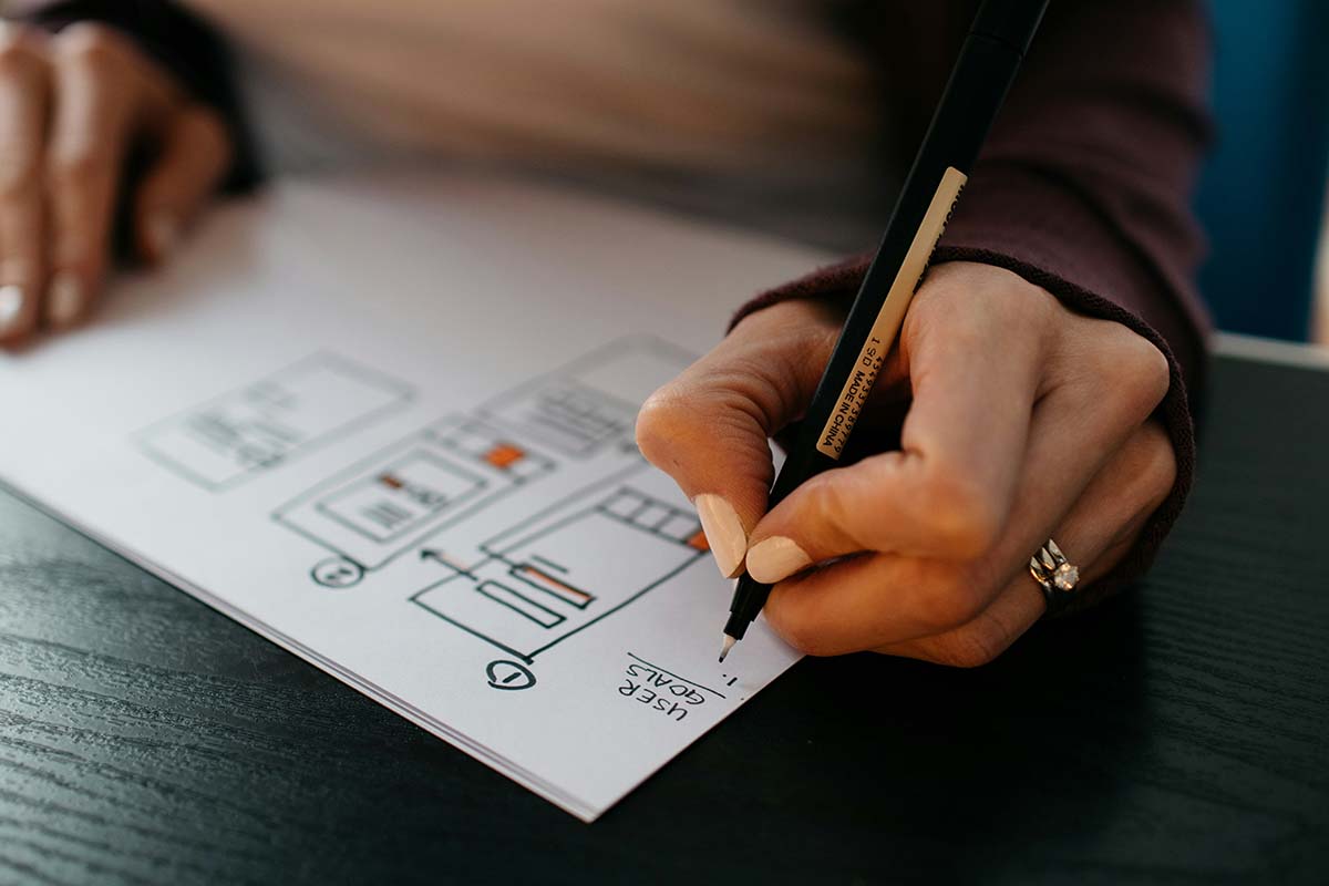
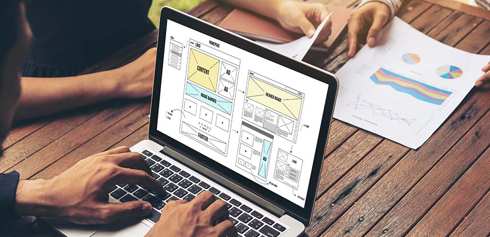
A lot of thought and planning goes into designing a website. Today, our design team benefits from decades of research about the psychology of how users navigate websites. Along with years of practicing to enact those principles, we have a better sense for creating an intuitive experience. For businesses, that helps users effectively learn about your business and complete purchases or hire you. We’ll explain some principles from psychology behind creating intuitive user experiences.

The Psychology of Web Design

Most humans process visual information in a similar way. Our eyes and brains work together to comprehend complex visual information. Today, psychology has a better understanding of how these systems work. However, human brains and eyes didn’t originally develop for screens and computers. So, web design applies this knowledge from psychology to create websites that are intuitive for people to navigate and use. There are a few principles that have become standard in the psychology of intuitive user experiences.

Fitts’s Law

The psychologist Paul Fitts studied how humans select a target and created a model that predicts the speed humans move their aim to that target. Originally, Fitts was looking at pointing, but today computer scientists and web designers continuously use Fitts’s law for predicting how fast humans can intuitively navigate an interface with a mouse pointer or their finger. The two primary factors of speed in Fitts’s law are size and width. The larger and wider something is, the faster someone can target it. This is why buttons in web design are larger than other text and horizontally oriented.

Fitts’s law is a great example of how psychology is critical to intuitive and ergonomic web design. Rotating a button 90° to be vertically oriented would be the same size and potentially closer to a mouse pointer. Plus, it might seem a better choice for vertical displays like mobile devices. However, the psychology of human visual systems makes it so that a taller but thinner button is harder and slower to interact with, and so less intuitive.

Hick’s Law

Another important principle from psychology, the Hick’s or Hick-Hyman Law is all about limiting choice. This psychological principle shows how for every additional choice a person will logarithmically take more time to decide. This is why too many options can lead to “decision paralysis” where it’s hard to make any choice. For web design this means reducing the number of choices you present to users at one time so they more intuitively navigate through your website. For example, presenting 16 buttons that navigate everywhere on the first screen can immediately overwhelm a user. Separating these buttons into sections on a home page, or into their own dedicated pages in a navigation flow will create a more intuitive experience that guides users through the choices they want to make.

Gestalt Principles

Another important practice from psychology critical to intuitive user experiences on your website are “Gestalt Principles.” These principles are a system of how humans interpret and organize visual information we see by grouping and recognizing patterns. A few of these are extremely beneficial for creating intuitive websites.

Hierarchy

Information arranged into visual hierarchies is critical to any larger visual project. For example, online stores sometimes have tens or even hundreds of options. According to Hick’s Law, that could be paralyzing. Using visual hierarchies allows us to better organize those choices into a set of larger more refined choices. Consider how someone chooses food at a restaurant. They typically go through the larger categories (e.g. salad, entrees, soups) before picking a certain item in that group and then selecting the specific options for that dish. The same can be accomplished in web design: major product categories, a main product page, variations on that page.

There are various ways to create visual hierarchy:

  • Size – larger elements are seen as more important and attract more attention. This is why headings go up in size with titles as the largest.
  • Colour – colours with certain hues, more saturation, or high contrast will get more attention. This can be applied to buttons, icons, graphics, and text. In fact, it’s an old practice for text and is where the term “rubric” comes from. Rubrication was making certain text like titles or headers red in old manuscripts to visually stand out.
  • Alignment – Something’s placement can have it gain our attention first or last. This depends on culture and language. For example, those who read western languages tend to give priority to things more left and at the top, while those who read Arabic will give priority to things more to the right.

Proximity

Humans group things together that are visually close to one another. This is used in web design to create visual associations between copy, images, videos, and buttons. Those closer together are intuitively understood to be more related than elements placed farther away.

Similarity

Besides being close, we also create associations between things that are visually similar. This can be because of an associated icon, distinct font types, or using specific colours. For example, a solid colour with high contrast can intuitively identify buttons. Those colour associations can then be made more specific. If every reference to one kind of service your business provides is in blue and another is in red, a user intuitively understands the colour associations and how to navigate your site.

Remember Accessibility

Keep in mind that these psychological principles for intuitive user experiences are usually defined according to an average user. Don’t forget to consider accessibility when designing a website. A part of your design might not be as intuitive to someone who is visually impaired or lacks full colour vision. Ultimately, the best way to determine if your web design is intuitive is to test user experiences.

Mindful Design

We can’t discuss every way psychology has helped to develop intuitive user experiences in web design. However, these laws and principles have become fundamentals of visual design. Understanding the psychology behind them helps to create a mindful design. Through these principles, you can develop a website that is truly intuitive and that also accounts for accessibility. If you’re ready to create an intuitive user experience for your customers and audience, be sure to contact our web design team.

A rocket launching out of a laptop. A metaphor for speeding up website loading times.

One of the most common frustrations we experience today is watching a website slowly load in. Images pop in late, the page’s structure suddenly reorganizes itself and we’re back at the top, or we may never see the page at all. With the speed of modern data networks, usually a web page loads instantly. However, if a website hasn’t been properly optimized for speed and short loading times, it can suddenly become a snail. That’s not something you want for your business’ website. We discuss some of the best web design practices for ensuring faster load times for your website.

Why Website Speed Matters

Website load speed simply matters because it has a direct impact on your conversion rates. If your website is slower, you are less likely to get sales, orders, new clients, etc. This is the case for both B2C (business to customer) and B2B (business to business) businesses. Studies have shown that for B2B websites, a website that loads in 1 second has 3x the conversion of one that loads in 5 seconds and 5x one that loads in 10 seconds. The difference is similar for e-commerce B2C businesses, where a 1-second website has 2.5x the conversion rate of those loading in 5 seconds.

What is a Good Website Loading Speed?

In the simplest terms, the faster a website loads, the better. However, a website will always take some time to load, even if a fraction of a second. It might be easier to determine when the average becomes frustrated and gives up. Studies’ have found that its best to remain within 2.5 seconds, and the longest ideal time for a webpage to load is 4 seconds. After that, the conversion rate drops to half of what it was at 1 second.  

Determining Your Website’s Loading Time

To optimize your website’s loading time, you need to determine its speed. For a proper test, you need to consider different network speeds, device types, and that each page will have a different speed. Thankfully, Google has developed a free tool for the job: PageSpeed. Just by entering your business’ URL, PageSpeed will run a full a diagnostic on your website’s loading times. The test can also be run for a mobile device or computer, helping you determine if a certain version of your website has a speed issue.

Putting Your Website in High Gear

Once you determine your website could be faster, you will need to start optimizing. Here are some of the essential practices for speeding up your website’s load times:

Reducing Image Sizes

One of the main factors that affect a website’s load time is file sizes. A user’s device needs to download these files from a website to display them in their browser. Text is overall fast for a device to load. However, images, if not optimized, can be large and slow down your website considerably. Best practice is to keep the largest dimension of a website at 1200px or below. If you’ve used raw or stock photos, these tend to be 3 or 4 times bigger and just as hefty. File format is also important. JPEGs and PNGs can be relatively small in file size, but a WEBP is overall a more optimized format for website loading times.

Embedding Videos Rather than Hosting

Pictures can be large files; videos can be huge. That’s why a best practice for website speed is to upload a video to another service like YouTube or Vimeo. These allow you to embed a video on your site, making it part of the page’s display while keeping it hosted on these other services. Devices will retrieve the video from these faster sites while also keeping your site’s load size and time down.

Preventing Long Pages

An essential practice for website speed optimization is limiting the size of web pages. For example, if someone browses a store’s inventory, the page should not try to load all 250 products at once. That will slow the page down. Instead, make sure your website uses pagination or progressive loading for larger sections of your site. These smaller sections will take less load time and have less impact on a browser.

Look at Apps, Widgets, Plugins, etc.

Apps, widgets, and plugins often provide essential functionality to a business’ website. However, by adding that additional functionality, they can also increase a website’s load time. Monitor how these apps affect your site’s performance and weigh the importance of their functionality against their speed impact. Also, keep these add-ons updated with regular website maintenance. This will keep the tools optimized while also preventing any security vulnerabilities that could develop in older versions.

Some of Our Favourite Optimization Tools for Website Speed

Along with Google’s PageSpeed, our web team has two favourite tools for optimizing a website’s load time:

  • WP Rocket: This WordPress tool manages the website’s cache, cleans up the database, removes unused CSS, and defers JavaScript to prioritize a page’s content.
  • Shortpixel: This convenient tool will convert and deliver images on a website into WEBP format.

Don’t Wait on Improving Your Website’s Load Times

Now you know some of the essential best practices for improving and optimizing a website’s load times. We recommend optimizing your site right away. That swift website speed will provide your users with an optimal experience on all their devices. In turn, that improves your business’ conversion rate. If you want help optimizing or maintaining your website’s speed, contact our web design team.

Someone building an effective homepage on their laptop with stats.

Your website’s homepage plays an important role. It’s the first impression of your business’ digital space. It also doesn’t have a lot of time to provide that introduction. The average user stays on a webpage for only 5.94 seconds and they judge it in only 1/20th of a second. As a result, your homepage needs to be purposefully designed to create a proper impression quickly. For that, it needs to look good, communicate effectively, and motivate your visitor to stay and use your site. Our website design team has the first steps so you can start building that impressive and effective homepage. 

Who Are You?

Your homepage should clearly and concisely present what your business is and does. Name and display your main services or top products as the central thing visitors first see as they land on your homepage. They will immediately understand your business and see its products/services. This should also come with a short description that identifies your business’ name and what it does. First-time visitors to your site will not be familiar with your business. Use this opportunity to provide that information and show off your value proposition.

Navigable

Along with explaining who you are and what you can provide your visitors, you want to make it immediately clear how they can navigate your site for more information or products. Link the central images and descriptions to the appropriate dedicated pages so visitors can access them. The top should include a navigation bar with clear categories and page titles, so users know where to look and find what they are interested in. In addition to being a directional aid throughout your website, the navigation bar will quickly impress any visitor with the contents of your website, allowing them to understand its contents and services more quickly. Furthermore, your homepage will regularly be the return point for browsing. This easy navigation will ensure customers can readily move to the next page that interests them.

Calls To Action

Another aid to navigation that also helps keep a visitor interested is a call to action (CTA). Common examples are a prominent button in the middle of the page or in the navigation bar with a unique, contrasting colour. These will encourage your visitor to go beyond the homepage and guide them through your website’s main pages. The most common examples are “Shop Now”, “Learn More”, “Contact Us”, “Book a Consultation”, or “Request a Quote”. These short, simple instructions will also help a visitor immediately contextualize the products/services your website provides.

Newsletter or Contact Form

Presenting your visitor with a pop-up of a newsletter signup or contact form is an additional call to action that will keep your visitor connected to your website. These allow customers to learn more about your business, stay connected and return, and might include a discount as an incentive to purchase from you. 

Do not present this pop-up right away. Allow your customers to get their impression of your homepage and maybe browse a bit before prompting them with signing up to their newsletter or suggesting they provide contact information. An immediate popup will prevent them from seeing your informative homepage and come off as pushy. Why would they sign up for a newsletter or want to contact you before they know who you are?

Less is Better

Not overwhelming your visitor is essential. Minimalism is a hallmark for designing your website’s homepage. A homepage with too much text, images, video, or CTAs will only confuse or frustrate your visitors. Just like when first introducing yourself, stick to the essentials and be concise for a good first impression. Provide a single large image, a short blurb, and one CTA that shows the essentials of your business. Not every visitor will have the same interests about your business, so it is best to provide the basics and have them navigate deeper in for what they want. Additional details should be placed in their own dedicated pages that visitors can easily access through the navigation bar or calls to action. 

Optimized for Multiple Devices aka Responsive

A proper first impression means your website needs to function properly on various devices, particularly computers and mobile devices. As of this month, over 60% of web traffic comes from mobile devices. Your homepage needs to inform your visitor, allow direct navigation, and provide direction easily and elegantly on all of those different devices. If a visitor arrives on your homepage and not everything is visible or navigation is cumbersome or impossible, they will be left with a poor impression of your business and leave.

Adaptable

Your homepage should adapt to how visitors use and browse your website. Monitor website traffic to determine where users are going. If a specific service or product page is more popular, highlight it more immediately. This will sooner impress future visitors with the information they want. Remember you have less than 6 seconds. For example, if customers typically browse your new product page, it is a good strategy to link the “Shop Now” CTA to that page. Running user experience (UX) tests of your homepage and website will help you discover such potential site traffic patterns as well as unintended obstacles. Ever heard of heatmapping? Ask us about it!

Home is Where the Heart Is

Your homepage is the heart of your website. It introduces your business, directs visitors, and acts as the regular return point for browsing. It also does not have a lot of time to impress your visitors to stay and start exploring the deeper chambers of your website. These essentials will help guide you to create a homepage that gives the proper impression and welcomes your visitors. If you are looking to redesign or update your homepage to give your business the proper introduction it deserves, contact Rosewood’s website design team.